


Similar Components with Different Styles in Chakra UI

When building components with Chakra UI v3, you might need to create similar components with slight variations in styles, such as different background colors. How can you manage these variations efficiently?
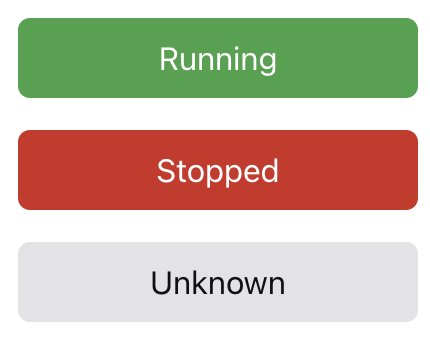
Let’s consider a ServerStatus component that represents the running state of a server. A simple version of this component might look like the following:
import { Box } from "@chakra-ui/react";

export const ServerRunningStatus = () => {
  return (
    <Box
      w="200px"
      p={2}
      textAlign="center"
      borderRadius="md"
      bg="green.600"
      color="white"
    >
      Running
    Box>
  );
};
However, a server doesn’t only have a running state—it could also be stopped or in an unknown state. Since the display content is mostly the same, we can use a single component with props to control its variations.
import { Box } from "@chakra-ui/react";

type Status = "running" | "stopped" | "unknown";

interface Props {
  status: Status;
}

export const ServerStatus = ({ status }: Props) => {
  const bgColor = {
    running: "green.600",
    stopped: "red.600",
    unknown: "gray.600",
  }[status];

  return (
    <Box
      w="200px"
      p={2}
      textAlign="center"
      borderRadius="md"
      textTransform="capitalize"
      bg={bgColor}
      color="white"
    >
      {status}
    Box>
  );
};
To differentiate the states visually, we define a bgColor property. This approach works fine in many cases, and when new states are added to Status, a type error will occur if they are not handled properly. However, as the number of styles that need differentiation increases, managing them manually can get harder to manage.
Managing Multiple Styles
Now, let’s also manage text color along with the background color by simply adding another property:
import { Box } from "@chakra-ui/react";

type Status = "running" | "stopped" | "unknown";

interface Props {
  status: Status;
}

export const ServerStatus = ({ status }: Props) => {
  const styles = {
    running: { bg: "green.600", color: "white" },
    stopped: { bg: "red.600", color: "white" },
    unknown: { bg: "gray.200", color: "gray.600" },
  }[status];

  return (
    <Box
      w="200px"
      p={2}
      textAlign="center"
      borderRadius="md"
      textTransform="capitalize"
      bg={styles.bg}
      color="white"
    >
      {status}
    Box>
  );
};
While this works, there are a few issues. The biggest drawback is that styles lack type safety. If a value is incorrect, TypeScript won’t catch it, and auto-completion won’t be available.
Using Record for Type Safety
We can improve this by using a Record type:
import { Box, type BoxProps } from "@chakra-ui/react";

type Status = "running" | "stopped" | "unknown";

interface Props {
  status: Status;
}

const styles: Record<Status, Required<Pick<BoxProps, "bg" | "color">>> = {
  running: { bg: "green.600", color: "white" },
  stopped: { bg: "red.600", color: "white" },
  unknown: { bg: "gray.200", color: "gray.600" },
};

export const ServerStatus = ({ status }: Props) => {
  return (
    <Box
      w="200px"
      p={2}
      textAlign="center"
      borderRadius="md"
      textTransform="capitalize"
      {...styles[status]}
    >
      {status}
    Box>
  );
};
By using Record, we ensure that every Status has a corresponding style definition. Using Required is optional, but it guarantees that both bg and color exist for every Status. Additionally, since we leverage BoxProps, we benefit from TypeScript’s auto-completion.
If different statuses require different numbers of style properties, we can structure the mapping flexibly:
const styles: Record<Status, BoxProps> = {
  running: { bg: "green.600", color: "white" },
  stopped: { bg: "red.600", color: "white" },
  unknown: { bg: "gray.200", borderColor: "gray.800" },
};
This approach might be sufficient in many cases. However, what if we need to define more complex styles? Writing a large number of styles directly in the component can reduce readability.
Separating Styles with Chakra UI’s Recipe
Chakra UI provides the Recipe feature, which allows us to separate styles from the component logic. Let’s see an example:
import { Box, defineRecipe, useRecipe } from "@chakra-ui/react";

type Status = "running" | "stopped" | "unknown";

interface Props {
  status: Status;
}

const serverStatusRecipe = defineRecipe({
  base: {
    textAlign: "center",
    w: "200px",
    p: 2,
    borderRadius: "md",
    textTransform: "capitalize",
  },
  variants: {
    status: {
      running: { bg: "green.200", color: "white" },
      stopped: { bg: "red.600", color: "white" },
      unknown: { bg: "gray.200", color: "gray.600" },
    },
  },
});

export const ServerStatus = ({ status }: Props) => {
  const recipe = useRecipe({ recipe: serverStatusRecipe });
  const styles = recipe({ status });

  return <Box css={styles}>{status}Box>;
};
By using defineRecipe, we can write styles with type safety and auto-completion. The combination of base and variants allows us to naturally define common styles and their variations. This separation improves readability and maintainability.
Moreover, serverStatusRecipe can be placed in a separate file or even within Chakra’s theme configuration, making it highly reusable across the application.
Conclusion
Depending on the complexity of the styles and the need for reusability, you can choose the best approach for your use case. Whether using simple prop-based styling, a Record mapping, or Chakra UI’s Recipe, each method offers different benefits in terms of maintainability and scalability.
, Once and for All (3/21/2025)")

