


")
Explore a New Digital Edition of Printing Types, the Authoritative History of Printing & Typography from 1922

Times New Roman has been around since 1931, longer than most of us have been alive — and for longer than many of us have been alive, word-processing applications have come with it as the default font. We tend, therefore, to regard it less as something created than as something for all intents and purposes eternal, but there was a time when publishers had to actively adopt it. The first American firm to start using Times New Roman was the Merrymount Press, which had already made a highly prestigious name for itself with publications like the elegant Book of Common Prayer financed by no less a captain of industry than J. Pierpont Morgan. But other printers knew Merrymount for a book that would have inspired in them an equally worshipful impulse.
“Released in 1922 with a later revision in 1937,” Printing Types: Their History, Forms and Use “became known as the standard work on the history of [printing and typography] and a basic book for all interested in the graphic arts. This two-volume work spans nearly 450 years and includes detailed analyses of the printers and type designers and their work.”
So writes the designer Nicholas Rougeux, previously featured here on Open Culture for his digital editions of vintage books like Illustrations of the Natural Orders of Plants; British & Exotic Mineralogy; A Monograph of the Trochilidæ, or Family of Humming-Birds; Werner’s Nomenclature of Colours; Euclid’s Elements, and Pierre-Joseph Redouté’s collections of rose and lily illustrations. His latest project to go live is a painstakingly assembled digital edition of Printing Types, which you can explore here.
That book was also originally the work of one man, Merrymount Press founder Daniel Berkeley Updike. “During his tenure at Harvard University, he taught a course on Technique of Printing in the Graduate School of Business Administration for five years,” Rougeux writes, “the lectures of which served as the basis for Printing Types.” In the book, Updike offers a history of “the art of typography from the dawn of Western printing in the fifteenth century to the beginning of the twentieth — focusing primarily on European printing in Germany, France, Italy, the Netherlands, Spain, and England as well as the United States.” In tracing “the development of type design,” he also discusses “the importance of each historic period and the lessons they contain for contemporary designers.”
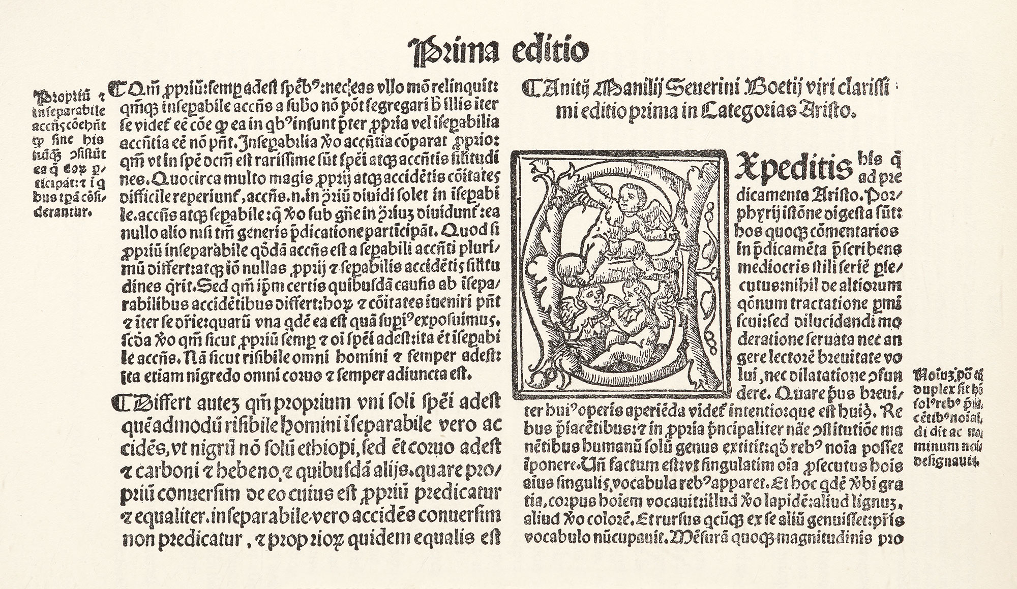
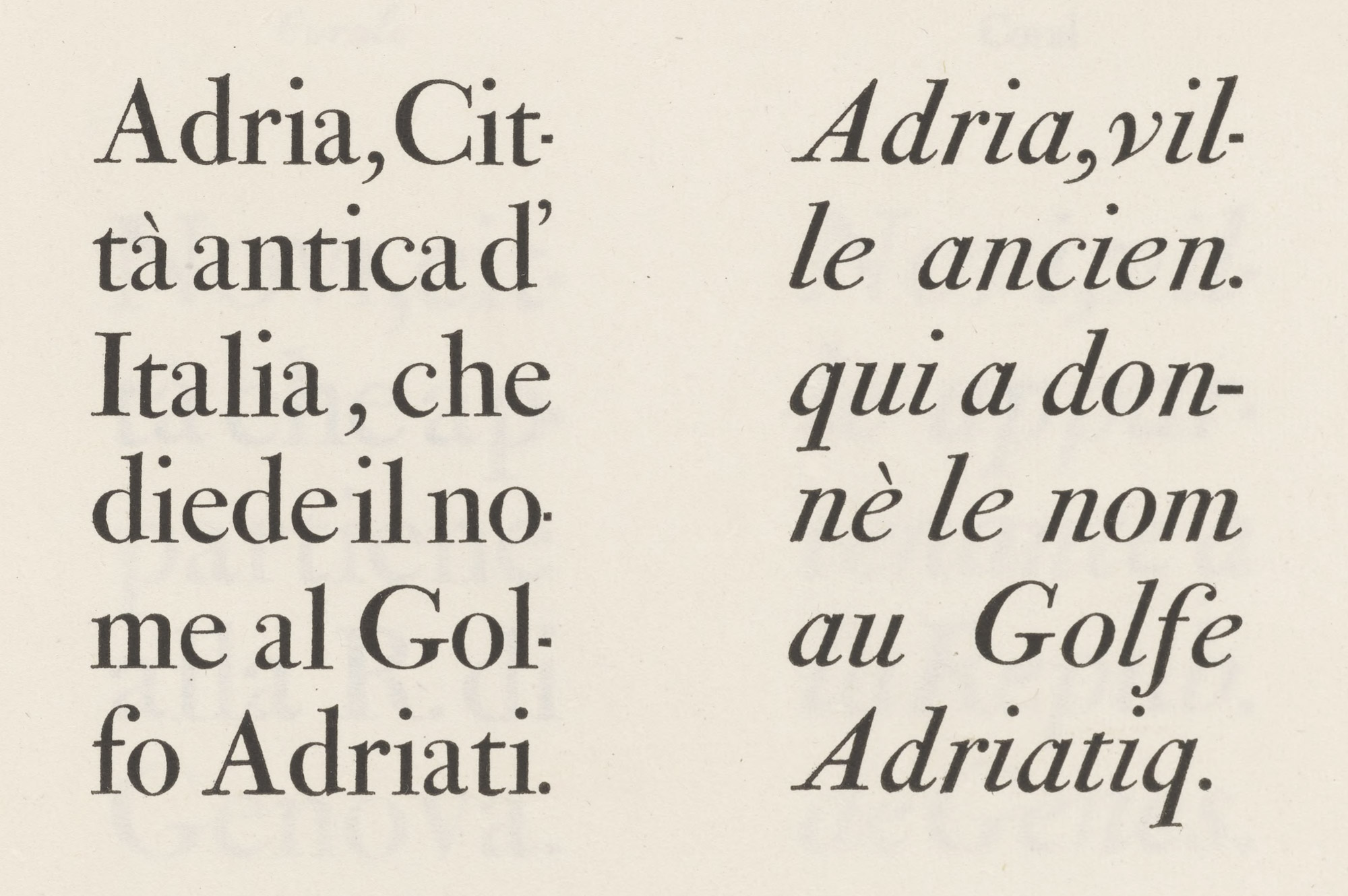
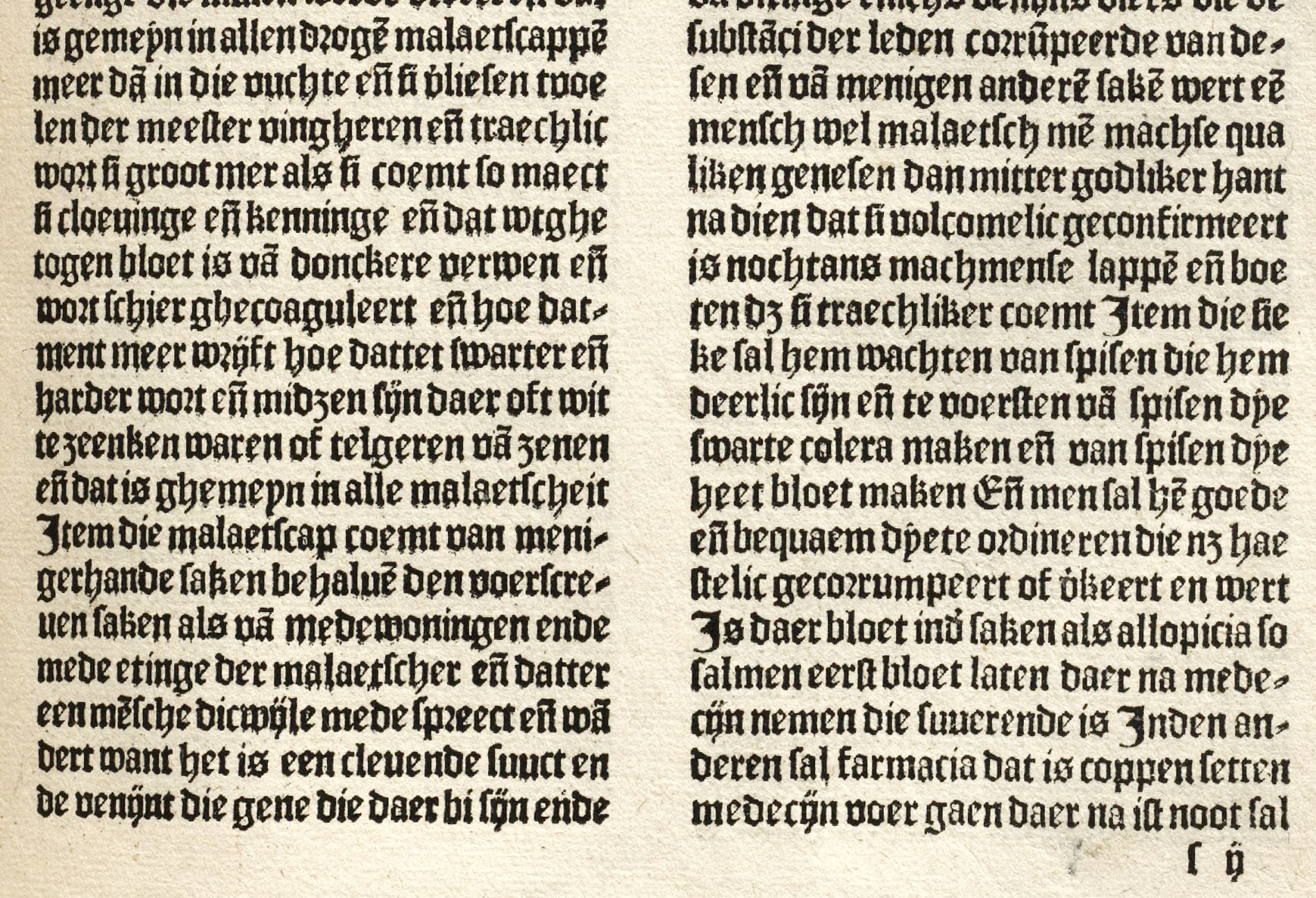
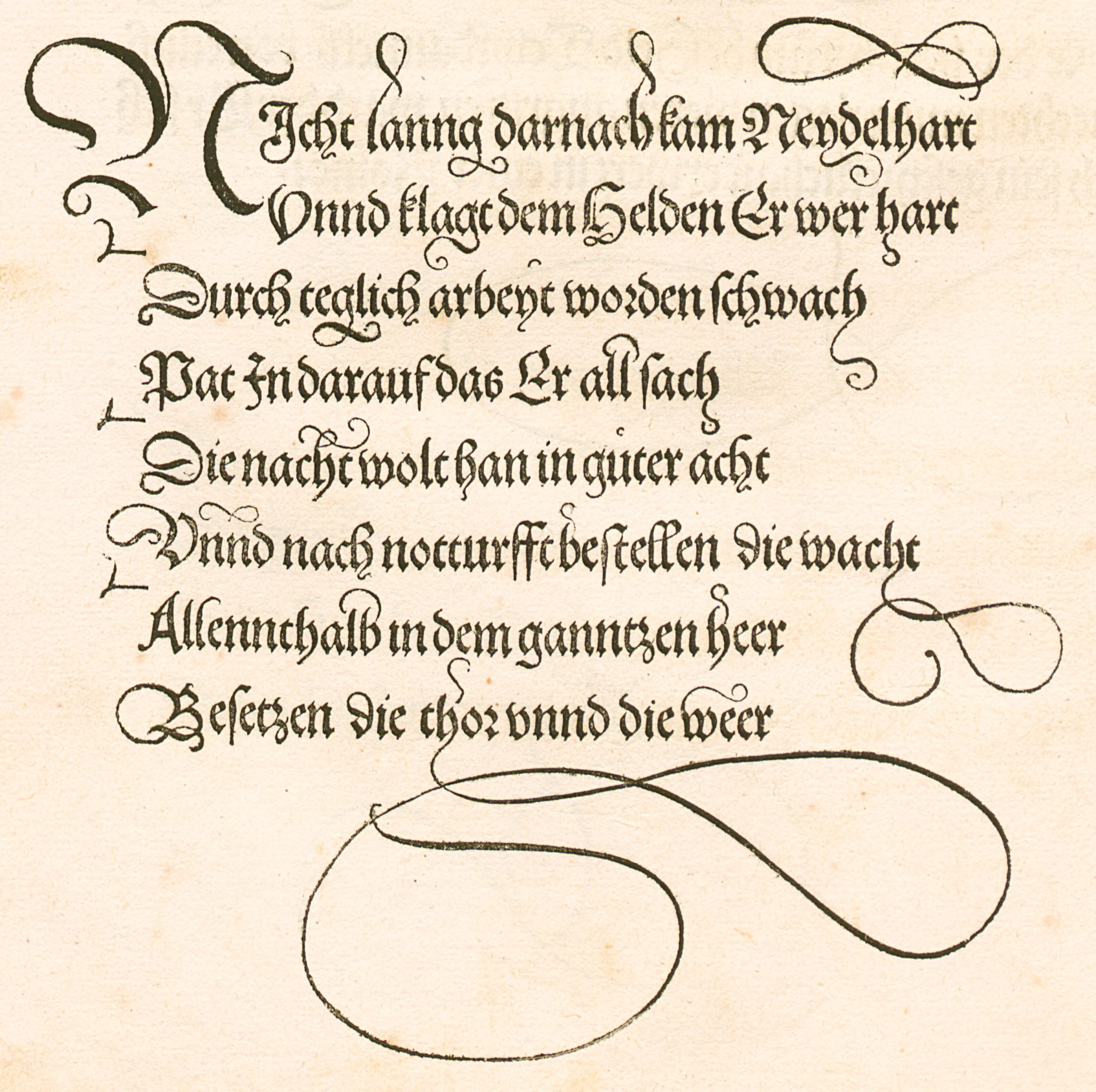
Originally published in 1922 and extensively revised in 1937, Printing Types long stood as the authoritative history of typography in the Latin alphabet, with its “more than 360 facsimile illustrations showcasing examples of typography, borders, flowers, and pages pulled from the books covered.” Tracking down the sources of those illustrations constituted no small part of the painstaking production of Rougeux’s digital edition, and the 100 of them most highly praised by Updike have also been made available for purchase in poster form. For those who do a lot of work with text, in print or digital forms, it could provide just as much motivation as an actual copy of Printing Types on the shelf to find our way beyond the defaults.
Related Content:
The History of Typography Told in Five Animated Minutes
Behold a Digitization of “The Most Beautiful of All Printed Books,” The Kelmscott Chaucer
Fonts in Use: Enter a Giant Archive of Typography, Featuring 12,618 Typefaces
Based in Seoul, Colin Marshall writes and broadcasts on cities, language, and culture. His projects include the Substack newsletter Books on Cities and the book The Stateless City: a Walk through 21st-Century Los Angeles. Follow him on the social network formerly known as Twitter at @colinmarshall.


